
Responsive design.
A term that has been being used a lot these days. And, for good reason. Just the other day at a bar-b-que a friend was asking me about it and wanted to know if I could help another friend with their site to make it a responsive design site.
For those of you would don’t know what that is, well it’s quite simple and has been rising in popularity recently because it’s a very useful piece of functionality that really makes a site far more dynamic.
Many sites are only desktop friendly and when viewed on a tablet or mobile device it doesn’t conform to the new environment and so the site pages appear as they do on the desktop and to navigate around you’ve got to really blow up the pages just to see what’s there. That can become quite annoying and site owners can lose a lot of traffic because of that.
Simply put, responsive design means the code in the background of the site adjusts the content to appear differently depending on what device it’s being viewed on.
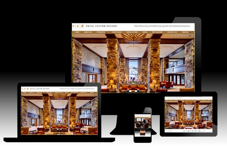
We designed the Royal Custom Design site as a custom site to not only show their 500+ product mages of furniture but also to be responsive to whatever device it was being viewed on; Desktop, Laptop, Tablet and mobile phone.
As the width of the device decreases the content is pushed to the new width and the visitor scrolls down to see everything easily without having to play with sizing at all.
And that is basically the function of a responsive design web site.
Now, if you have a site that needs to be responsive design friendly we can suggest additional code to enable the site to conform to that functionality or we could utilize a “theme” template that has the responsive code built into it already. Many new site themes come with this already installed such as almost all WordPress sites.
Contact us so we can bring your site up to today’s specs.


Leave A Comment
You must be logged in to post a comment.