

There are many points to consider about web design, but we’ve isolated what we consider the top 10 most important. Let us know what you think and if your site has these points in place. If it doesn’t, you might want to show them to your web master or call us to look into adding them as a web maintenance program.
1. DOES YOUR LANDING PAGE FIT ON ALL SCREENS?
When you land on a web site home page or promotional page, do you enjoy having to scroll down to see the information? Good web design should take into consideration the different size screens it will be viewed on. From the smallest laptop to the largest Mac screens. Usually, you can use a standard size that will work for almost every monitor such as 1000 pixels wide by 760 pixels deep.
2. LESS IS MORE
Most of the time there seems to be the idea to squeeze in as much as you can on a page as long as there’s room. All this does is forget the most important factor -web design should act much like an ad. The most effective sites lead off with a clean headline which grabs the attention of the viewer and makes you want to read on about what the service or product promises followed by a call to action. That call to action asks the visitor to either buy or contact and isn’t that what the page is there to do? So, less clutter and more clean info.
3. TAG…YOU’RE IT!
Tagging images in web pages enables search engines to find your site easier when someone is applying keywords to what they’re looking for and it shortcuts them right to your doorstep. It’s a very important aspect of SEO and helps immensely in the process.
4. CONTACT FORMS
Contact forms are vital and a primary way for visitors to communicate with you and ask questions. There should be at least one contact form and it’s not unusual for webmasters to insert them on every page.
5. COPY COLUMN WIDTHS
In good web design, it’s much easier to read copy when the width of the columns is not too long. It’s easier on the eyes when you don’t have to consider if you’re reading the next line down or skipping a line because you’re just read copy that’s as wide as your monitor. Try opening a site with a two or three-column width article and then a site that has copy columns that are almost 1000 pixels wide and you’ll see the difference almost immediately.
6. NAVIGATION
Most visitors just want to be able to find the page they’re looking for easily and a simple, straight forward navigation system really does make the difference. It’s all about the organization on the page and how easy it is to get around.
7. SHOW ME THE VIDEO!
Videos are an asset in more ways than meets the eye. Search Engines like them and they are interest builders. It’s a proven fact that people like to watch videos on a site and if they load quickly and don’t take too long to get the information across to your visitors, all the better for closing them on your service or products. Try a simple introduction using a video and watch your visitor stats go north.
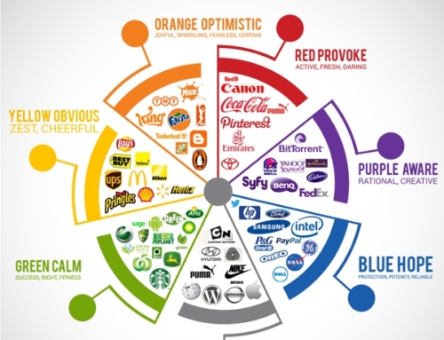
8. COLOR AS A “COME ON”
Everyone has their favorite colors but it’s hard if not impossible to figure out the correct color scheme for the masses so usually the best thing to do is decide one of two ways to go. If your product or service is about something in nature then of course you can use those colors that are most recognized such as greens and neutral browns and colors that are warm. For those of you who are in manufacturing, colors that are more on the cool side such as blues and darker grays will do the trick. The most successful color schemes are usually neutral colors and grays with a spot color such as blue, orange, green or red. These color schemes allow the images to do the work of inserting extra color without the page looking too busy.
9. WHAT TYPE ARE YOU?
Typography styles are both a plus and can be a minus as well. First, you have to use a type style that communicates with your product. Then there’s the problem of not all computers will have all the type style you want to use so you’re limited in your choice. Here’s where a good type designer comes in handy. You don’t need type to scream out of the page which it will do visually if it’s too large and if it is in caps. Pick a typeface that’s easy to read, an appropriate size, and also sometimes a dark grey is easier on the eyes than black.
10. BE YOUR VISITOR
One of the most important aspects of good design in not only web sites but as a general rule is to step back after the initial work is complete and look at it from a fresh viewpoint. How does it look to you if you’ve never seen it before or as the first time?
Check out this site we designed for Arlington as an excellent example of the above points: https://shereshevsky.net/portfolio-items/arlington-economic-development/

![]()


Leave A Comment
You must be logged in to post a comment.