
🎬✨ #HollywoodHistory #MoviePosterDesign #FilmAnniversary
 In 1975, I was living a dream—working as an art director and graphic designer in Hollywood, creating original logos, motion picture posters, and marketing materials for major studio films. It was the golden era of cinema, with iconic titles like Star Wars, Jaws, and One Flew Over the Cuckoo’s Nest in production.
Now, on the 50th anniversary of One Flew Over the Cuckoo’s Nest, I’m looking back at one of my most meaningful experiences in the world of film branding and visual storytelling.
The Design Brief: Crafting an Iconic Film Logo
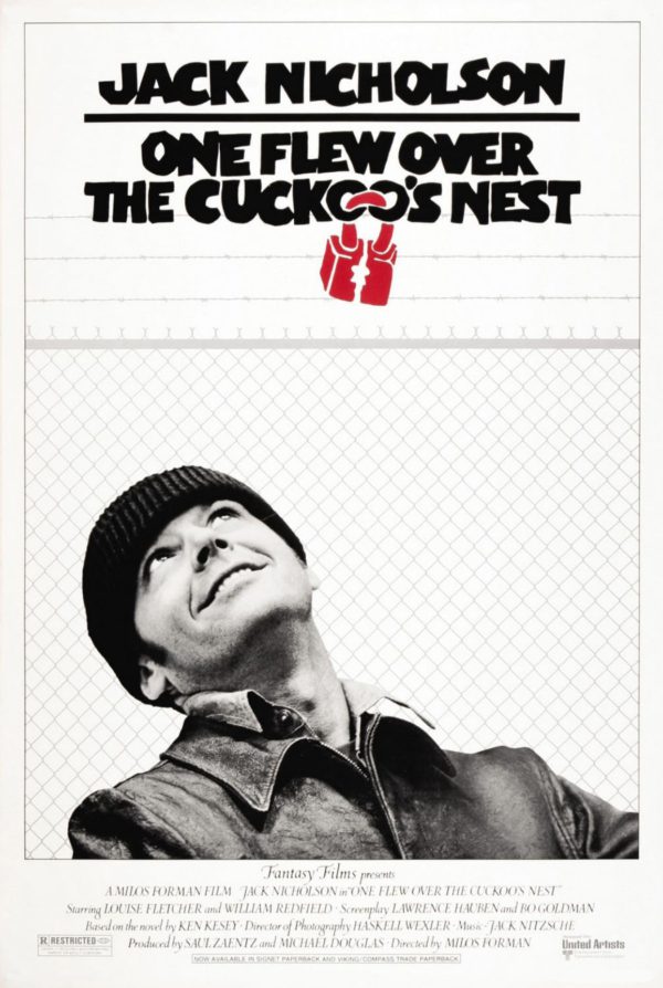
When I was asked to develop a film logo design for One Flew Over the Cuckoo’s Nest, I began by reading a synopsis of the movie. The emotional weight of the story and the intensity of its characters led me to take a bold, expressive approach.
As a designer with deep roots in typography, having trained in New York City’s top ad agencies, I believed that type could be more than just text—it could speak. I decided to use a broad-tip black magic marker to create a hand-drawn, custom logotype. The raw, imperfect style captured the film’s gritty psychological tone.
To further communicate the movie’s themes of confinement and rebellion, I incorporated a broken padlock into the logo—connecting the letters and reinforcing the symbolism of being trapped and breaking free.
The Pitch: Presenting to Hollywood Royalty
A few days after sketching the logo, I was invited to present it during a meeting with the film’s producers—none other than Michael Douglas and Saul Zaentz. At the time, Douglas had just secured the rights to the novel from his father, Kirk Douglas, and Zaentz was a powerhouse producer based in San Francisco.
I walked into Tony Seiniger’s office, where the two were seated on a couch. Nervously, I showed them the logo mock-up. To my relief and excitement, they immediately said, “That IS the logo for the film!”
Tony turned to me afterward and said, “Don’t clean that logo up—they love it just the way it is!” I smiled and replied, “It’s finished—it’s meant to look rough. That was the point!”
Behind the Scenes: Magic Markers and Trade Ads
As the film gained critical acclaim and entered Oscar consideration season, the studio launched a series of For Your Consideration trade ads. To maintain brand consistency, I had to hand-letter dozens of actor and crew names in the same magic marker style I used for the logo.
Let’s just say I went through a LOT of pens!
A Funny Note About the Poster Design
When it came time to design the official movie poster, Tony mentioned, “My wife had a great idea—to add a tennis fence behind Jack Nicholson.” I chuckled because what she meant was a chain-link fence, commonly called a storm fence.
Calling it a “tennis fence” was a subtle nod to her social background, but hey—it was a great visual addition. That simple texture helped convey the institutional confinement central to the film’s story.
Celebrating a Cinematic Milestone
Today, we celebrate 50 years of One Flew Over the Cuckoo’s Nest—a film that won 5 Academy Awards, including Best Picture, and left an indelible mark on cinema.
I’m proud to have played a small part in that history through film logo design and Hollywood poster art. The creative freedom and collaboration I experienced then still inspire me today.
🖤 #OneFlewOverTheCuckoosNest #FilmDesign #ClassicCinema #MichaelDouglas #SaulZaentz #MovieLogos #GraphicDesignHistory #HollywoodLegends #PosterArt #TypographicDesign #1970sCinema #AcademyAwards #DesignStorytelling


Leave A Comment
You must be logged in to post a comment.