Project Description
The Art of Logo Design: Featuring the New Buildstrong Logo
A logo is more than just a symbol; it’s the face of a brand. It communicates a company’s identity, values, and professionalism in an instant. Designing a logo requires creativity, strategy, and a deep understanding of what a brand represents. In this article, we’ll explore the principles of logo design and showcase the new logo we designed for Buildstrong, a company that embodies strength, durability, and innovation in the construction industry.
Understanding the Importance of a Logo
A well-designed logo is crucial because it:
- Establishes Brand Identity – It creates an immediate connection between a company and its audience.
- Builds Trust and Credibility – A professional logo signals reliability and expertise.
- Differentiates from Competitors – A unique design helps a brand stand out in a crowded market.
- Enhances Brand Recognition – A memorable logo ensures customers can easily recall the company.
- Reflects Brand Values – The right colors, typography, and design elements convey the company’s mission and vision.
Key Principles of Effective Logo Design
- Simplicity – A clean and uncluttered logo is easier to recognize and remember.
- Versatility – The logo should look great across all mediums, from business cards to billboards.
- Relevance – The design should align with the brand’s industry and values.
- Timelessness – Avoiding trendy elements ensures a logo remains effective for years to come.
- Scalability – It should be legible and impactful at any size.
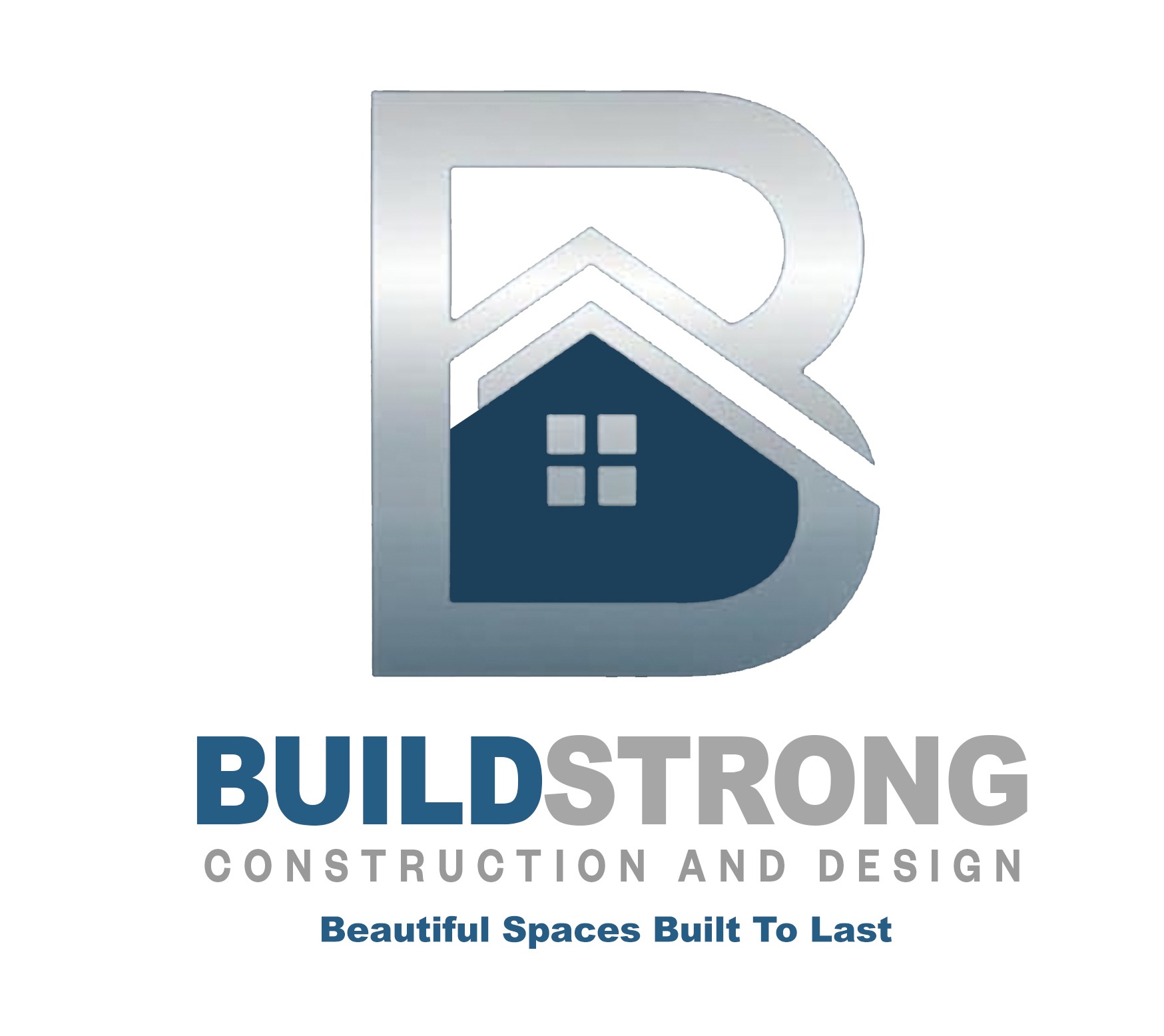
The Buildstrong Logo: Strength and Modernity Combined
About Buildstrong
Buildstrong is a forward-thinking construction company known for its high-quality craftsmanship, innovation, and durability. They needed a logo that would communicate their commitment to strength, reliability, and modern construction techniques.
The Design Process
1. Research and Concept Development
Before designing the Buildstrong logo, we conducted market research to understand the brand’s positioning, target audience, and competitors. The goal was to create a logo that reflected Buildstrong’s core attributes: resilience, professionalism, and innovation.
2. Choosing the Right Elements
- Typography: We selected a bold, geometric sans-serif font to convey strength and stability.
- Colors: The palette includes deep blue for trust and professionalism, combined with an accent of metallic silver or orange to symbolize innovation and energy.
- Symbolism: The logo features a stylized “B” that integrates architectural elements, such as a strong foundation and structured lines, to represent the company’s industry.
3. Finalizing the Design
After rounds of sketches and digital iterations, we arrived at a modern, clean, and authoritative logo. The Buildstrong emblem is distinct and instantly recognizable, embodying the company’s mission of building with excellence and integrity.
How to Use the Buildstrong Logo Effectively
A great logo is only effective if used correctly. Here are a few key tips:
- Maintain Consistency: Use the logo consistently across all branding materials.
- Ensure Proper Sizing: Make sure the logo is readable and clear at different scales.
- Use Approved Colors: Stick to the brand’s color palette for uniformity.
- Choose the Right Background: Ensure the logo is displayed on backgrounds that enhance visibility.
Conclusion
Designing a logo is a strategic and creative process that requires attention to detail and an understanding of the brand’s identity. The new Buildstrong logo successfully reflects the company’s commitment to strength and innovation in construction. Whether you’re starting a new business or rebranding an existing one, investing in a well-designed logo is essential for long-term success.
If you’re looking for a unique and professional logo for your brand, reach out to us today! Let’s build something iconic together.